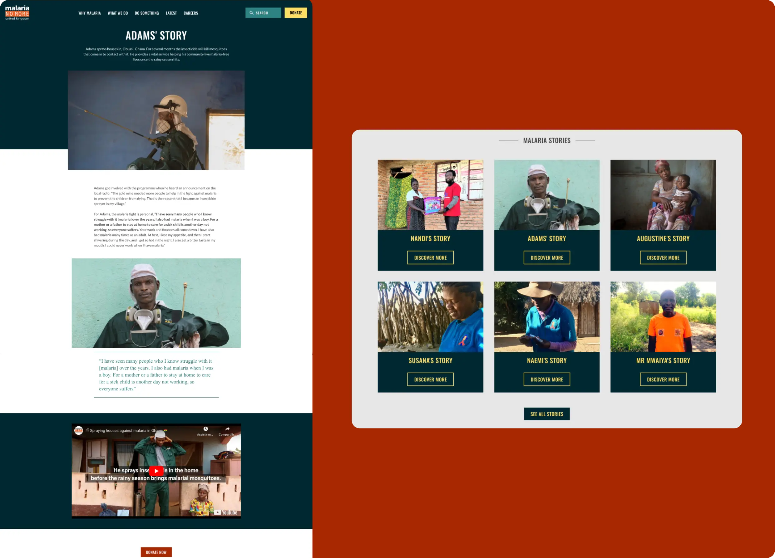
Back to Case Studies
Revamping Malaria No More UK's Website: A User-Centric Approach

Case Study

Revamping Malaria No More UK's Website: A User-Centric Approach

Challenge

Revamp and modernise the website for the British representation of the international NGO Malaria No More. We focused on enhancing the website's visual appeal (UI) and improving user experience (UX) on top of the current codebase. It was crucial to strike a balance between the changes Malaria No More UK wanted to implement, their actual needs, and the limitations posed by the current technology.

Skills

UI/UX Design

Web Development

Year

2023

About

Malaria No More UK (MNM-UK) is a non-profit organization that aims to end deaths caused by malaria.

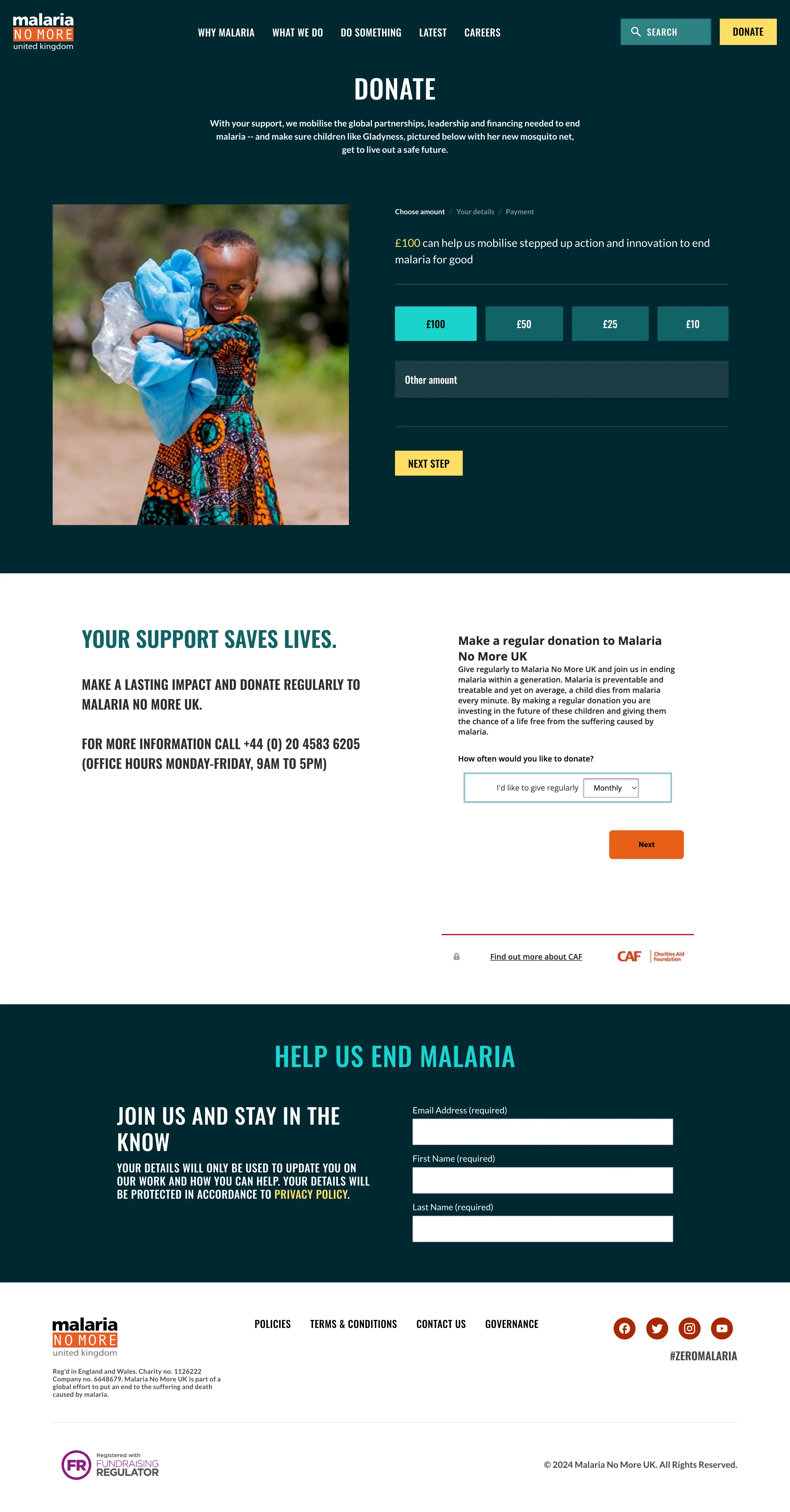
For this project, Marzee joined forces with their Communication and Marketing team to modernise the NGO’s institutional website without building a new one from scratch. The project had a defined set of parameters - budget, time and preexisting codebase/framework - that our team had to consider to be able to deliver the best outcome.

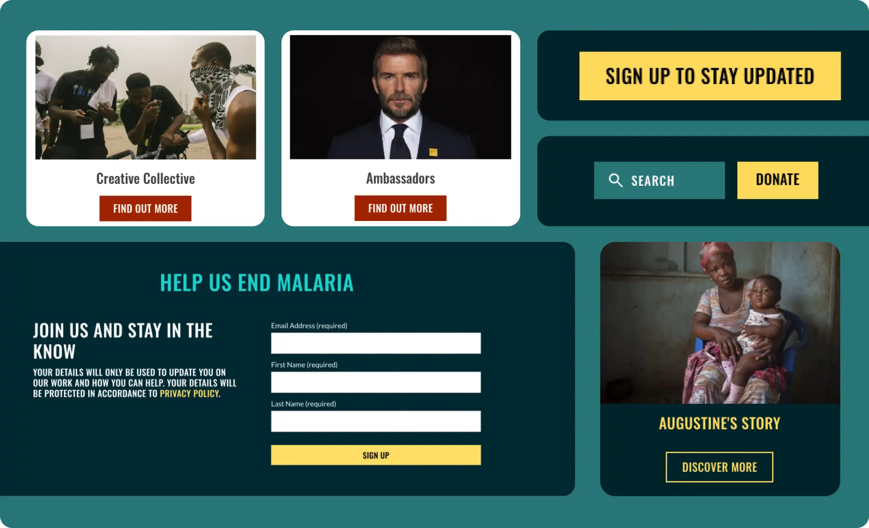
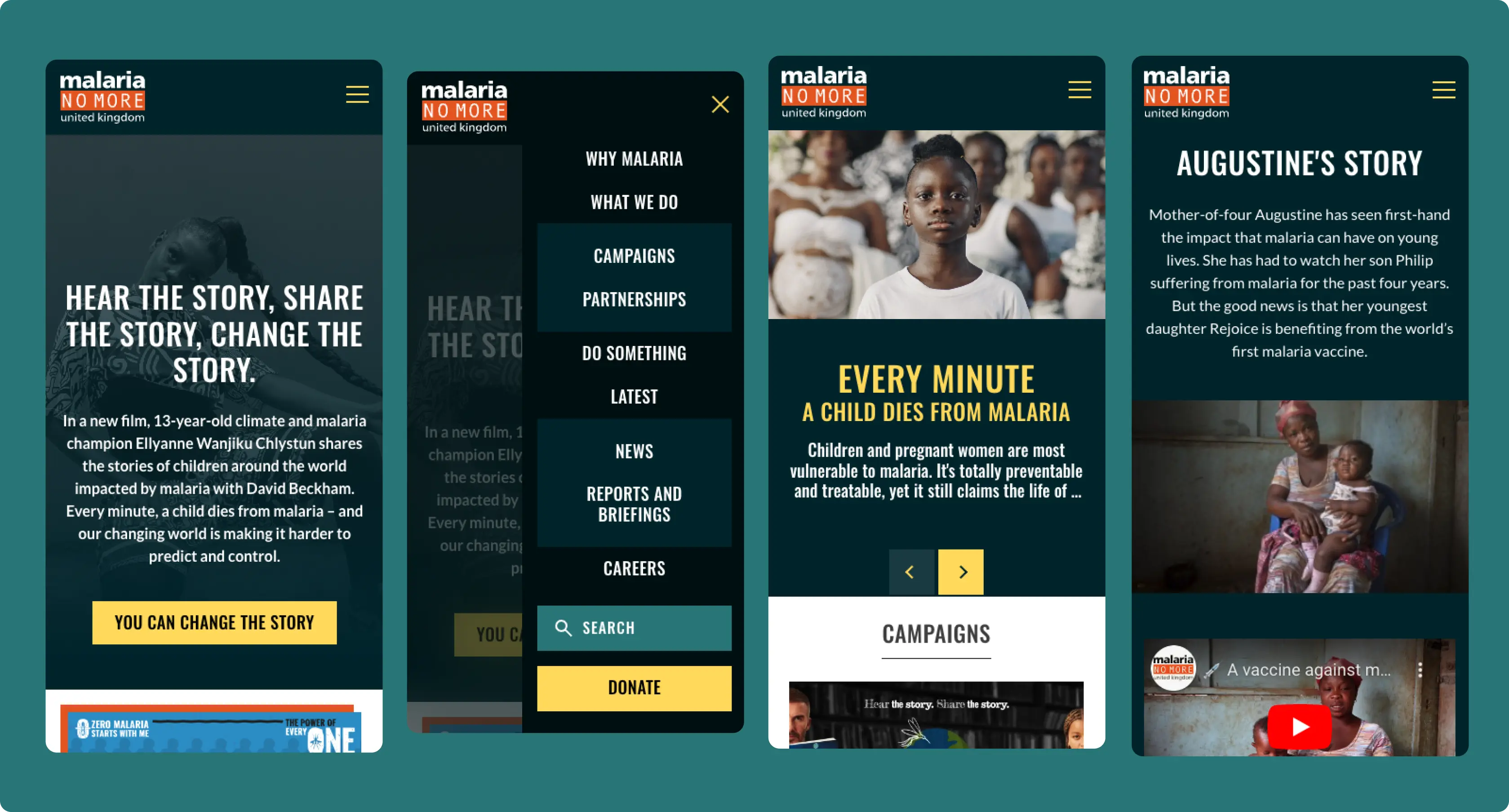
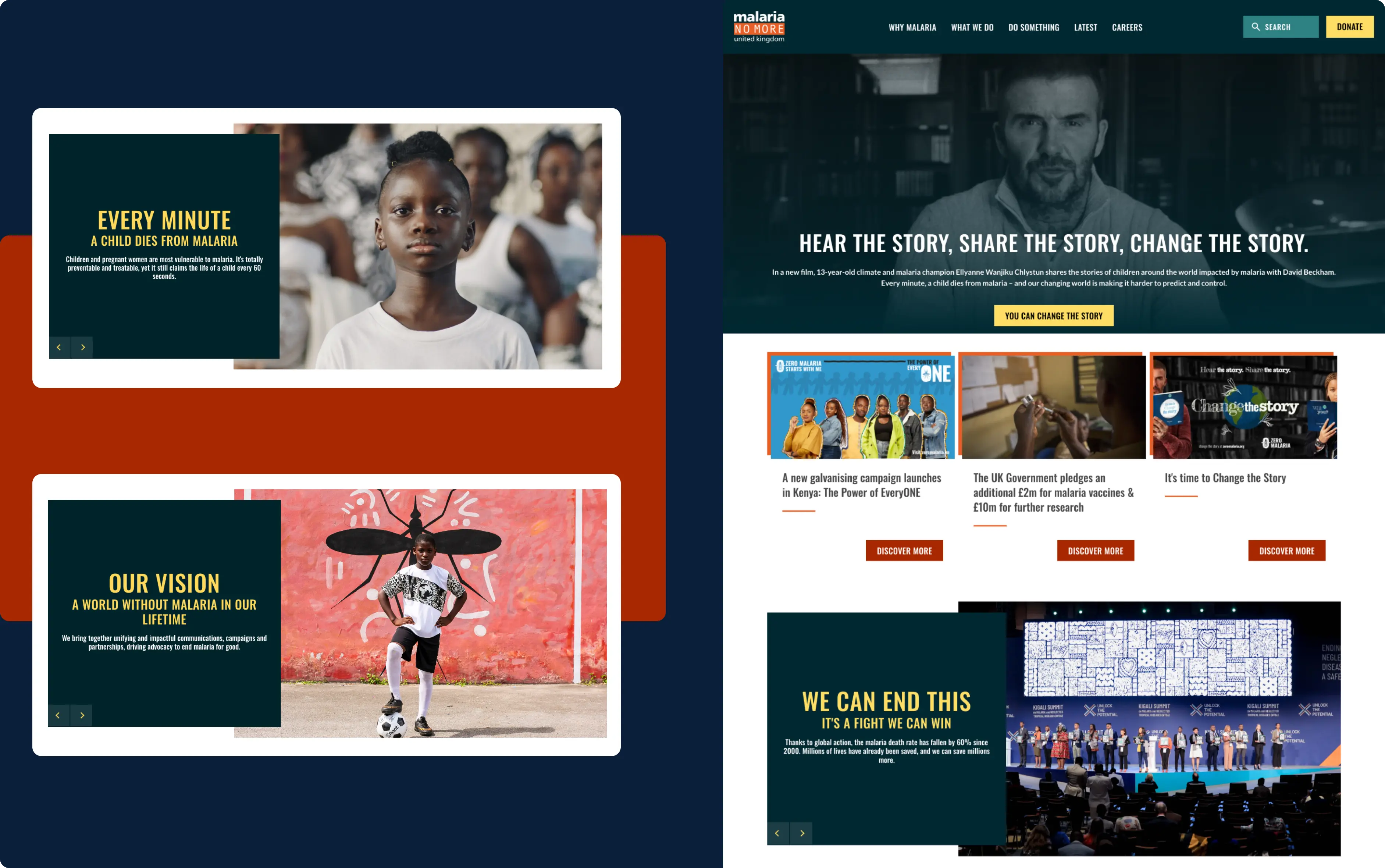
Our intervention aimed to enhance the overall user experience by improving navigation, streamlining user interaction and optimising page loading speed.

Homepage Video

Discovery Phase

When the team at MNM-UK expressed their concerns and dislikes regarding their current institutional website, we began by understanding the extent to which they wanted to redesign it.

The aim was not to build an entirely new website but rather to modernise the existing one within the framework that had been in place for many years.

The first step was to inspect the website's code base, understand its current state and pinpoint areas of improvement. Since we weren't facing a start from scratch, we needed to take a deep dive into the current site, inspect the code and learn our limitations beforehand. It was vital to understand what could be done. It was important not to propose features that couldn't be achieved within the framework, timeline, and budget constraints.

Beyond the UI/UX changes looking to provide a fresh and appealing look and feel to the MNM-UK institutional website, we identified a series of improvements in the code base to enhance the site’s performance. We recommended updating their server infrastructure to modernise it and reduce server costs.

Tech Stack

Our team worked on top of a pre-existing Drupal 7 architecture.

The website already had a lot of content and a valid structure, so we didn't want to start from scratch. Instead, we made changes on top of the existing Drupal 7 framework, which was challenging because of its limitations and the amount of custom code developed by a previous vendor. We had to learn and discover where and how the custom code worked and understand the extent to which we could go with the redesign.

Tech

Drupal 7

Tech

Platformsh

Project Highlights

The Malaria No More UK website redesign aimed to enhance navigation and accessibility while preserving user familiarity and improving visual appeal (UI) and user experience (UX) within the existing codebase. Striking a delicate balance between the organization's desired changes, actual needs, and technological limitations was crucial.

  1. Highlight the Donation section

    The MNM-UK website serves two primary purposes: to educate the public about the issue of malaria and to collect donations for the NGO. During the redesign process, special attention was paid to the donation page and the entire donation process.

    Since Malaria No More UK relies on an external service to collect donations, our team was limited to the iframes provided by that service. However, we improved some of the elements we could control. The most significant change was placing the donation options at the top of the page, making them easily accessible to users. Additionally, we added a background colour to this section to increase visibility and improve readability.

    Moreover, we included extra text and information to enhance the user's understanding of the donation process and the impact their contribution can make.

    Redesign of the Donation Page
  2. Enhancing Accessibility

    Our goal was to improve website accessibility while staying true to the brand identity. To achieve this, we incorporated modern design elements that would appeal to the target audience without deviating too much from their familiarity with the website/brand.

    Website Accessibility

    We reviewed and expanded the brand's colour scheme to include more contrasting and complementary colours that would enhance the overall appearance. We also optimised the typography, colour usage, whitespace, and responsiveness performance across various devices. By doing so, we created variation, accentuated hierarchies, and maintained a consistent brand identity that would make the website more accessible and user-friendly for all.

    Mobile details
  3. Improving Overall Navigation

    As part of the redesign, we focused on improving the user experience by adding movement and visual consistency. We widened the website to create more space for content, which not only reduces clutter but also improves readability. These changes have made the website more accessible and user-friendly for everyone. We were able to elevate the website’s navigation and make it easier for users to find the information they want.

    UI/UX Redesign for NGO

    We also introduced background colours to different website sections to make specific content stand out and enhance the overall visual appeal. We focused on drawing users' attention to particular content or calls to action, such as donation buttons or important messages about malaria.

    Malaria stories
  4. Migration to a Cloud-base server

    The development started with migrating the website and other MNM-owned websites from a physical server to a cloud-based server. Our chosen provider was Platformsh, based on their reliable support services, robust security protocols and competitive pricing.

Results

The redesign of the Malaria No More UK website yielded tangible improvements across various facets. Despite facing challenges inherent in working with a pre-existing codebase and limited expansion options, the project achieved significant milestones and enhancements.

Our team of developers was able to mitigate them with their knowledge of modern CSS, Drupal templating and Javascript or by coming up with creative alternatives.

  • Streamlining navigation and optimising page loading speed contributed to a 20% increase in average session duration, indicating improved engagement with the site's content.
  • By incorporating modern design elements and expanding the brand's colour palette, the website achieved enhanced accessibility (97 score in Lighthouse) without compromising its visual appeal.
  • Increased donation page visits by 50%.